Ecommerce optimizations
As the first UX Designer at The Company Store, an eCommerce website, I had the challenge of showing the value of UX to a very business-oriented team that, because of the background, was not used to thinking about the customer as a website user. I decided to come up with a list of quick enhancements that we could make on high-traffic areas of the website with the potential of having a high impact on conversion.

1. What could improve the product page experience for visitors?
I started with the product page, which was the page with highest traffic and therefore already had the attention of the main stakeholders.
Research
The first thing I did was to try and identify opportunities to solve problems that users were already having. I used Hotjar's heatmaps, recordings, and polling tool to observe behavior, gather some user feedback, and come up with a few hypotheses.
Heatmaps

By looking at the heatmap, I was able to quickly identify (and show others) the main components that users were interacting with, which in this case were the images, size information and selection, and colors. That started to narrow the areas of the page that I would pay attention to and investigate further.
Poll Question: If you could improve something on this page, what would it be?

I collected 60 responses to the question. There was a lot of variety in the answers, but there were also many repeated comments; the one element of the page that seemed to be relevant to many visitors was imagery. This also validated my observations on the heatmaps.
- “When you choose a color, it shows up larger on the picture!!! I am a great customer and I’ve been suggesting this for years! Please do this!”
- “Provide bigger pictures of colors as each is selected.”
- “View product larger”
Recordings
I looked at some recordings of visitors interacting with the page which gave me a closer look at their thought process.
Hypotheses
Based on the data, I came up with three hypotheses:
- If the product images are bigger and the gallery/lightbox is easier to use, then the customer would get a better feel of the product increasing the chances of converting.
- If some of the information between the name of the product and the primary CTA is removed, since it isn't relevant for the user at the moment of purchase, then the user would have less distractions and a better experience.
- The scannability of the product description can be improved by changing fonts, spacing, and weight, conveying a more premium experience for the user.
Mockups
Based on these hypothesis, I created a high-fidelity mockup and proposed it to the team walking them through the changes. Below you can see original design on the left, and the new design on the right, which was later implemented by an engineering agency.

2. What about opportunities for the product listing page?
After proposing a first iteration on the product page, I moved to the second one with most traffic: the product listing page. Visitors spent a long time browsing these pages to find new products and decide on which one to buy.
Research
I started by asking users for some feedback on the experience.
Poll Question: Is there anything on this page that doesn’t work the way you expect it to?

A total of 700 customers answered the question. It was interesting to see that most of our users didn’t think there was anything wrong with the page. However, looking at the 4.7% that did have something to say, I found some valuable feedback that directed my attention to specific elements.
- “Would love to see ratings to know what folks like, then I can look more closely at the ones that appeal to me”
- “need to filter by warmth”
- “Can see color sample when a color is selected”
Hypotheses
Based on the feedback and competitor analysis, I identified four elements that, according to my hypotheses, if implemented would improve the experience of this page:
- Refinements: Redesign the interaction to be more conventional and incorporate more attributes based on product features
- Category heading: Move from an image-based to a copy-based category heading
- Colors: Redesign the way colors are displayed under each product for a more consistent look
- Badges & iconography: standardize the way we communicate special features on products
Mockup
Below you can see the original design on the left, and the redesign on the right.

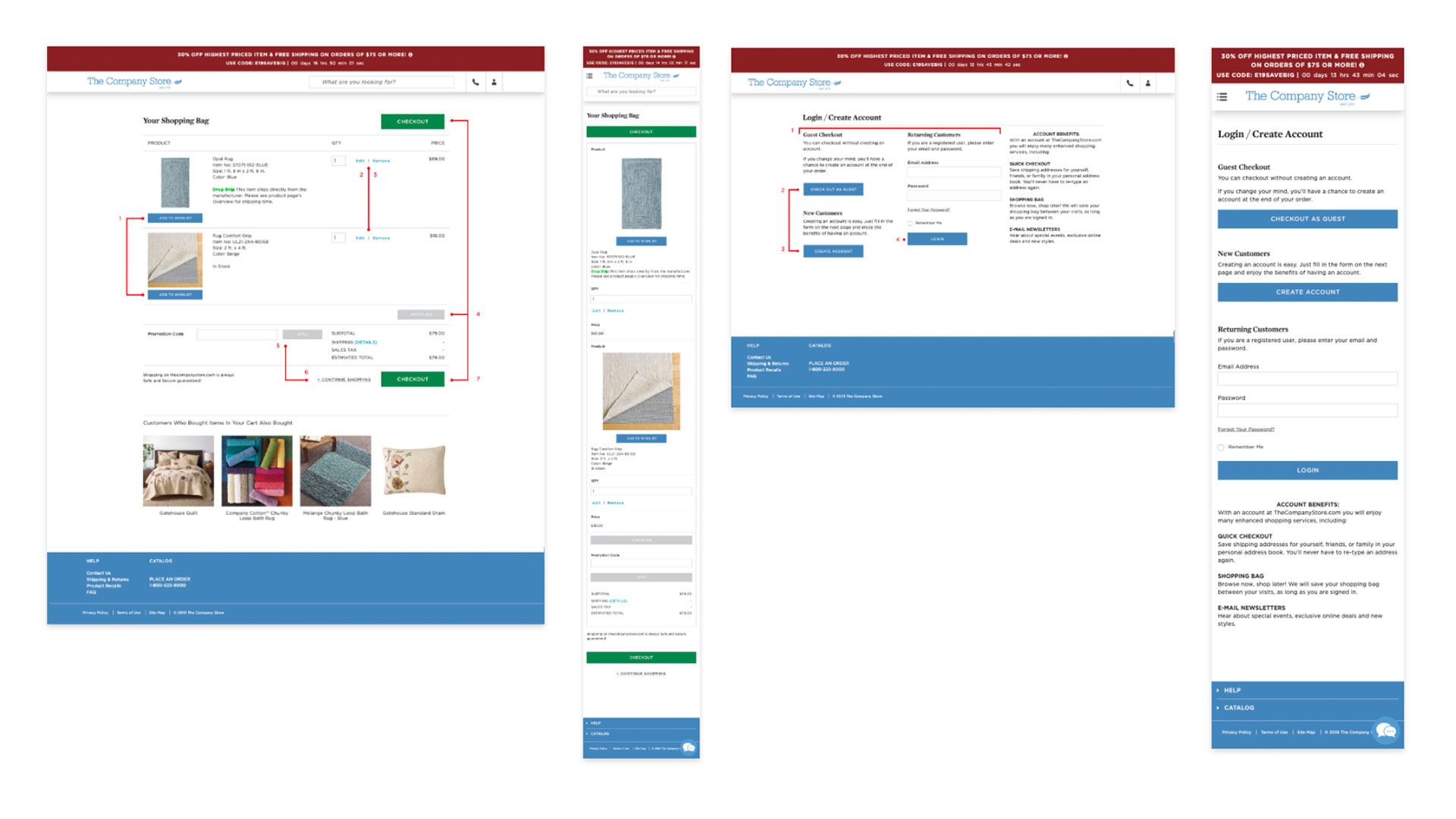
3. Quick wins on the cart and checkout flow
Continuing the first iteration of website improvements, the cart and checkout flow needed to be part of it, even if only some quick wins could be implemented at the time. I thought it was important to include it on the conversation because of the nature of the ecommerce experience - any improvement made on the pages before would ultimately take users to this flow.
Research
To identify opportunities, I decided to do conduct usability testing to actually observe people going browsing the website and going through this flow on several devices. I crafted some prompts, gathered decides around the office, booked a meeting room for a full day, and invited users that fitted the target audience. 4 sessions were enough to identify some patterns.

Findings
After observing the first 2 users, it became evident that there was an opportunity to make the experience clearer and easier to navigate. The other 2 served as confirmation.
On each touchpoint of the flow, they seemed to get distracted and have trouble deciding on what to do next and where to click. I thought this surfaced a great opportunity to standardize the buttons/call to actions in the experience, which would entice the user to move through the flow with higher clarity and ease, resulting in higher conversion. This proposal would also require low engineering effort, which fit into the scope agreed for this iteration.
Previews of the guide for the implementation of this update


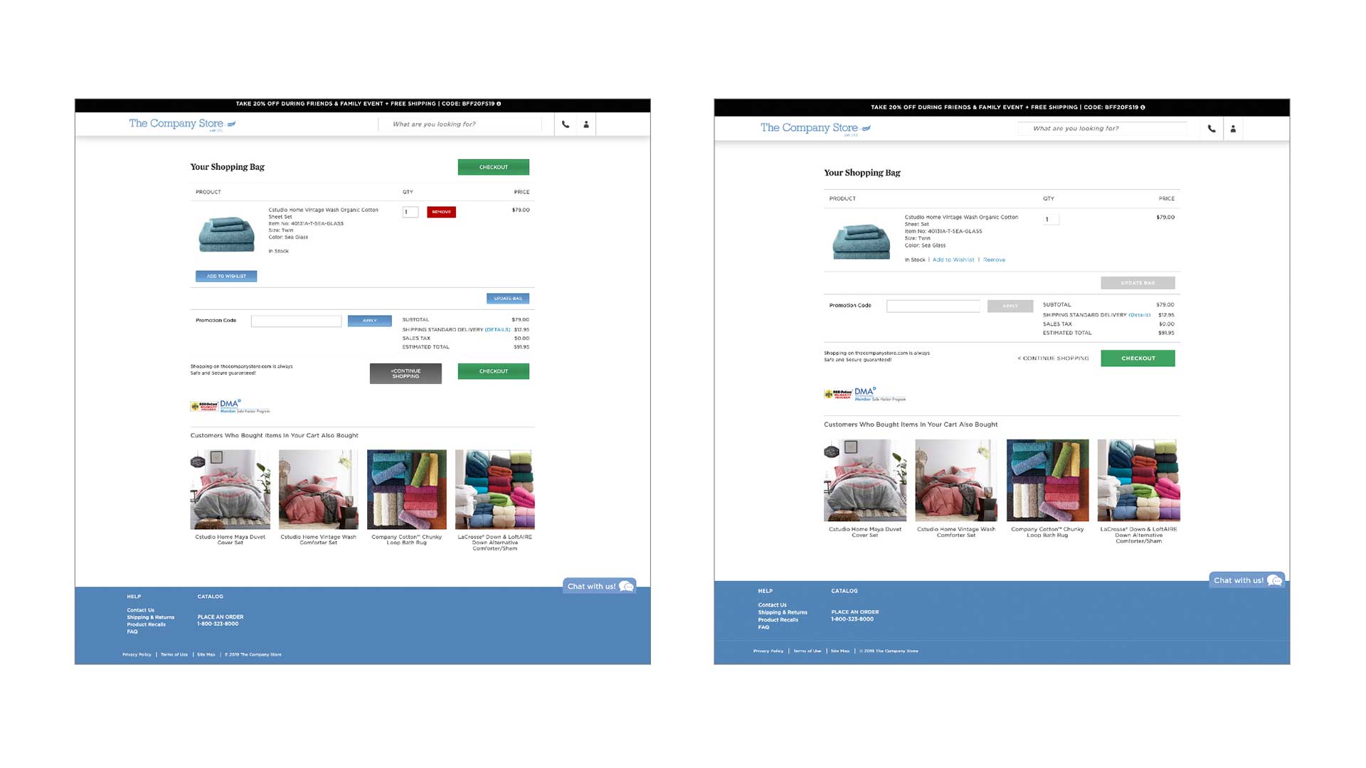
Before and after
Below you can see the cart page - original design on the left, and the page with the redesigned buttons on the right.

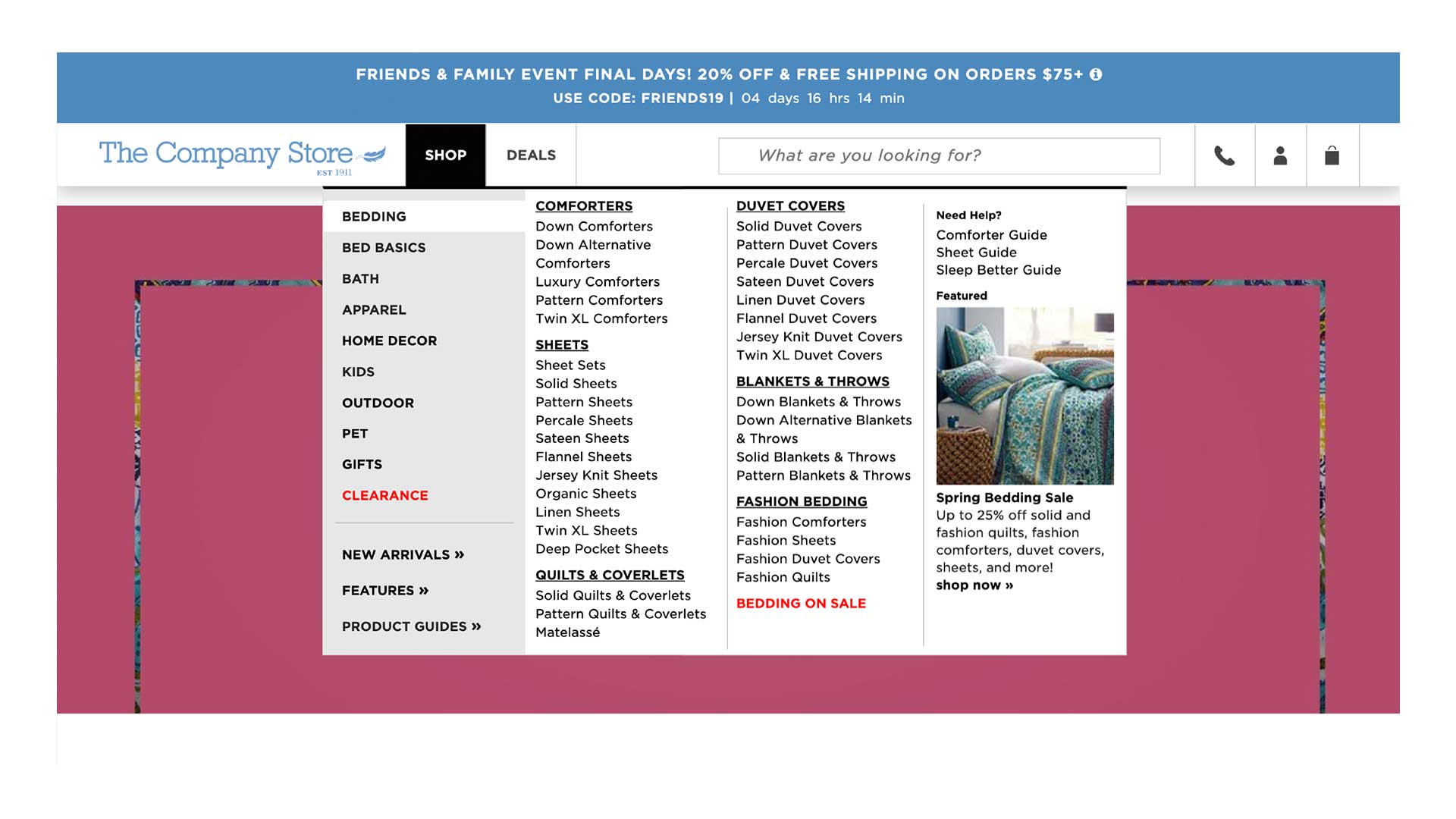
4. Making the navigation visually appealing
I also took the opportunity to propose a visual refresh on the navigation. I knew the team was working towards positioning the brand as a premium one. Under that initiative, I made minor adjustments to the original design that could be quickly implemented and would have a high impact on the visitors perception while navigating the website. Below you can see the before and after.
Original
Redesign


